Week Six: From Colors to Conservation
Welcome to another week in the marketing isekai! This week has been both exciting and challenging, and at times, a little overwhelming. But that’s part of the journey—embracing this new subset of the marketing sphere, learning from other marketers, and collaborating with the team here.
Brand & Design Thinking
This week, I’ve spent a lot of time thinking about design and brand, particularly through learning about design systems in Figma. When you focus on user experience, you’re designing how people interact with your branding. This is especially important as I work on defining the Protected Areas Trust brand. It’s not a new brand, but rather, we’re formalizing its structure, which presents a unique challenge.
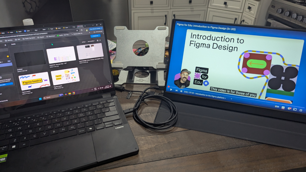
We already have values, a logo, and colors—we’re not creating them from scratch. Instead, my role is to ensure that these elements are used consistently. For example:
- Defining which shades of green and blue should be used to maintain consistency.
- Establishing which fonts should be used across different materials.
- Creating a system that ensures cohesive branding across presentations, documents, emails, and pitches.
Looking at examples from other conservation organizations has been helpful. Some brands clearly show the touch of a designer—everything works together harmoniously. That’s the goal here: to create a professional, colorful, and unique brand identity that reflects the energy and vibrancy of the people behind it.
Exploring Color & Accessibility
Color has been an exciting aspect of this project. I’ve been examining different shades of green and blue, considering their meanings and how they work together. Additionally, accessibility is a key factor—ensuring that colors contrast well against white and black backgrounds and remain legible over graphics.
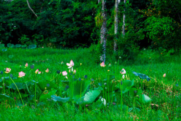
One of the strongest impressions I’ve had while working here is the sheer vibrancy—from the flora and fauna to the food and culture. I want to reflect that passion in our brand. The challenge is translating these ideas into a design language and a visual system that people can use effortlessly.
When design is done well, it blends seamlessly into the background. We encounter great design daily—on websites, in ads, in videos—without even realizing it. That’s the goal: a system that feels intuitive and natural while strengthening our brand identity.
A Week of Environmental Awareness
This has been a significant week for environmental events, including:
- International Forest Day
- International Water Day
- Earth Hour
Additionally, the Protected Areas Commission, our counterpart organization, hosted a tree-planting event in partnership with the government. Their project along one of the main roads was especially interesting as it involved planting a mix of local trees from South America and species from Africa and India to encourage biodiversity.
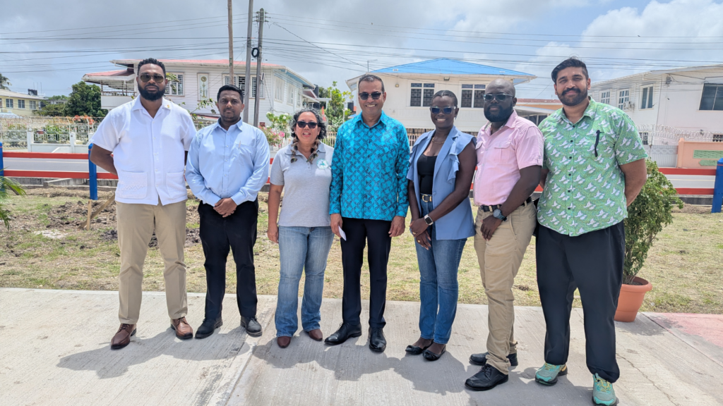
Trees provide more than just shade—they offer fruit, medicine, and environmental benefits. One of the most compelling aspects of the event was hearing people share personal stories about trees they grew up with, played under, and cherished. It was a powerful reminder of the universal connection people have with nature.
Closing Thoughts: The Good, The Challenge, and What’s Next
🤠 The Good: The weather has been great! It’s still the same overall climate, but there’s been more wind in the mornings, so I’m feeling about 10% less sweaty each day, which is delightful.
😱The Challenge: The fridge broke for a couple of days, which made food storage tricky. Luckily, the maintenance team fixed it quickly, but it was a challenge figuring out meals without refrigeration. It made me wonder how people managed before fridges were a thing!
😎 What’s Next: I have an upcoming meeting with the Protected Areas Commission. While they focus more on direct conservation efforts, I see an opportunity for collaboration. I’m looking forward to discussing ways we can work together on impactful projects.
That’s it for this week—thanks for reading! Hope you’re all doing well. See you next time!



No Comments